
In the United States, I’d have to rate Chicago far and away #1 in the use of official civic symbols (maybe the best in the world for all I know), and also note the overall high level of design quality of these objects. Today I want to focus on one particular aspect of this, the city flag and its uses.
The city flag is pictured at the top. I included a border on the image because of the white field. This was rated as the #2 city flag in America by the North American Vexillological Association after Washington, DC. I actually like Chicago’s better, because the aggressive asymmetry of DC’s flag is a bit off-putting to me.
The Chicago flag is also highly symbolic. The two blue stripes symbolize the cities waterways – the top Lake Michigan and the North Branch of the Chicago River, the bottom the South Branch and the I&M Canal – while the three resulting white stripes represent the North, West, and South Sides of the city. The stars also symbolize various things. There were originally only two stars, with the others added later, and there are periodic calls to add a fifth star, though four seems about right to me.
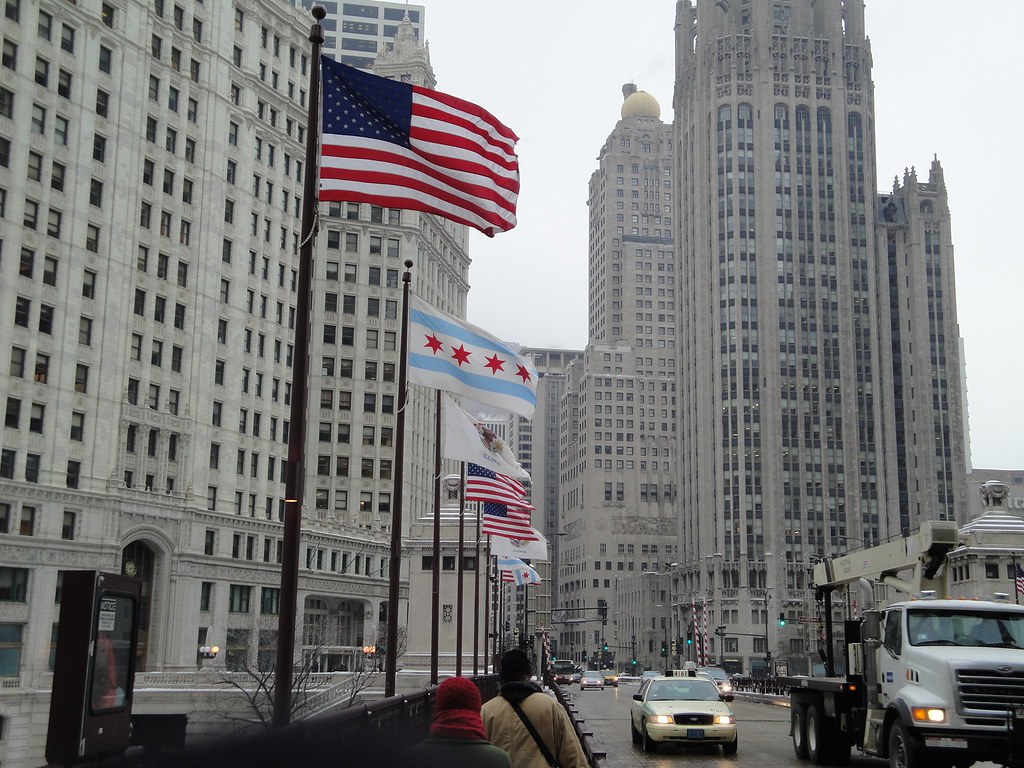
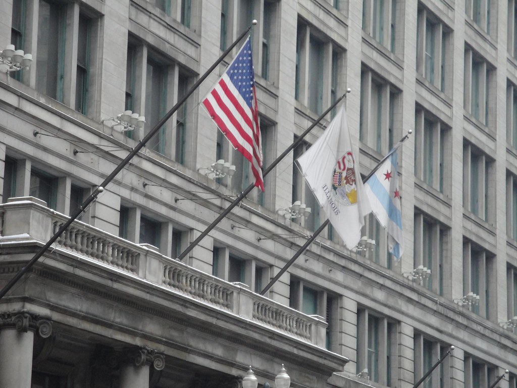
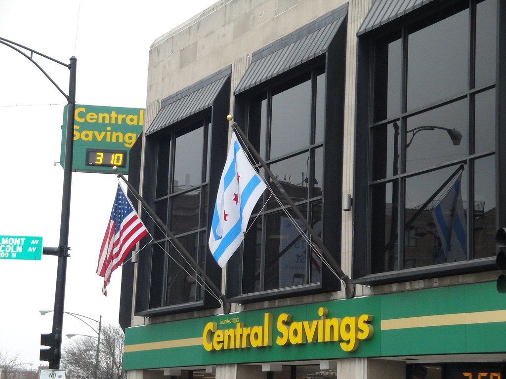
If you come to Chicago you’ll notice that the city flag is ubiquitous. In fact, the first place you notice it is when you arrive at O’Hare, where you see a large row of huge alternating US and Chicago flags at the roadway leading into the terminal. You’ll notice that the Illinois flag is missing. Illinois has, like most states, a lousy flag. While you see it at government buildings and around downtown, it is much more rare than Chicago’s own flag, giving what I think is a powerful sense of how the city likes to think of itself as a standalone entity in its state and region. (The contrast with Indianapolis is an interesting one. Indy also has a fabulous city flag, but one much more rarely used. And despite Indiana also having a somewhat dubious state flag, it is much more common to see in Indy than the city’s own flag. Of course, it is the state capital as well, but I don’t think that is the full explanation).
Here’s a picture of the bridge over Michigan Ave, featuring bold use of flags:

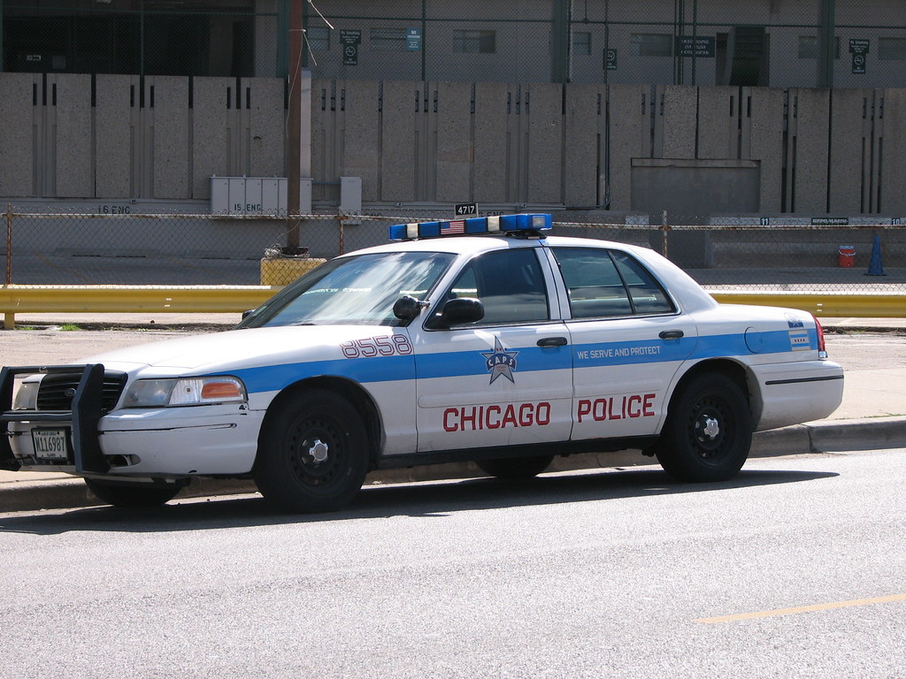
First the city. Here’s Chicago’s police car livery, which is based on the city flag. It’s also one of the finest police car liveries in the world. I’m not sure how far back this dates, but it’s as least as far the Blues Brothers movie. I don’t recognize the font (though I’m sure someone will post it about 5 seconds), but I love its aggressive blockiness that is perfect for the City of Big Shoulders:
Here’s someone who did their bicycle up in city flag style:


You can even buy Chicago flag soap:

Here’s one even I think it a little crazy. People are starting to tattoo themselves with the city flag. Here’s a picture of local mixologist Charles Joly I found via the 312 Dining Diva.

This post originally ran on March 13, 2011.
Still, one of my favorite posts. Once again I am talking myself off the ledge of getting a ChiCity tattoo. I feel as if I’m the minority without one!
Don’t disagree with the Chicago flag being great, but it’s a little unfair to criticize DC’s flag’s asymmetry. It’s not like a committee made a mistake — it’s based on a nearly thousand-year-old Coat of Arms from George Washington’s family.
http://en.wikipedia.org/wiki/Flag_of_Washington,_D.C.
I have friends in Chicago with the city flag wrapping a Chicago-style dog tattoed on their arms… and I’ve got a shot a cyclist looking for a bike gang to cruise the streets with with a custom Chicago flag crumpler on my blog: http://www.miriaminthemidwest.com/2011/11/janet-started-dance-party-revolution-my.html
In the 8 months I called myself a Chicago-an last year, I found this sentiment positively contagious. I’ve got a city flag pin that I wear with pride back here in Australia.
Gapers Block‘s logo features the six-pointed stars of the Chicago flag.
Great post, I loved the in-depth meaning of the Chicago flag so much so that I did a poster series exploring its meaning. http://knowyourflag.bigcartel.com/product/chicago-flag-4-posters-set
It’s sort of weird because, Chicago’s biggest national brands like The Bulls and Bears, use dark blue and a different red.
I doubt people who have visited Chicago know the flag or make a connection.
Nationally, the Pittsburgh flag is not well known, but the basic black and gold scheme is known by almost everyone.
I too love that city’s flag and have heard the call to add another star. WRONG!!! Adding another star to that flag would imploded the message the design sends about Chicago, (Big, Bold, Strong, Festive and Clean).
The 4 stars are perfectly scaled to deliver the Strong message.
But, it’s the shade of blue in the bars that clearly sends this design’s message into the stratusphere (clean).
I don’t need anyone to tell me what it means, (DC)…it speaks for it’s itself. Extremely well executed and smart. Graphic design at it’s best.
I agree with Aaron, that Indy has an amzing flag which should likely be used much more widely.
Oops. I meant to say that I doubt people who have not vistied Chicago know the flag well or make a connection.
Part of this is just that the basic color scheme is very generic. I mean-The Chicago Tribune’s colors don’t read as very different fron those of many other papers.
Another great example is the branding for 2016 Olympics bid
http://www.chicago2016.org/
Meng & I seem to share the same inspiration. My wife & I are handscreening some civic-pride with our own series of shirts on Etsy…one for each of the Red Stars.
http://www.etsy.com/shop/ElHurstOutfitter
@John
I think the importance of the Chicago city flag as an exported symbol of the city is secondary to this generation’s civic mind to embrace the city. It is impressive that citizen’s have made the reach toward an old symbol to reinvent and co-opt it as urban chic. I’d say they are proud and connected to the city. Impressive.
It’s funny that you’re talking about city flags. I was just thinking about this topic on my way to work today.
Interesting dichotomy when it comes to flags and the identity of a city. Chicago has a great city flag, but its widespread use speaks volumes about the nature of the city. It’s clear that Chicagoans see themselves as Chicagoans first, Americans second. Illinois may come a distant third, if that high.
But on the other hand, you have cities like Indianapolis, with a flag just as aesthetically pleasing and symbolic–if not better–and yet their flag is rarely flown around town, much less used in civic branding. Flags are a conscious physical manifestation of civic pride, but yet one has to practically search for the flag downtown, and it is hardly seen at all outside of the core of the city.
So the question becomes, do Indianapolitans have less civic pride compared to other cities, or do they simply identify more with Indiana first instead of the city? You correctly pointed out how the rather unassuming state flag is seen much more frequently around town, practically the direct inverse of Chicago’s situation.
This reminds me of an earlier piece you wrote about the STOP signs that have “City of Chicago” in small letters at the bottom.
Thanks for the comments.
@metrocard, I’m not sure I know the answer to that question. I wouldn’t say lack of civic pride is the answer though. I do think there’s something to the notion that people in Indianapolis have not thought of themselves as anything other than Hoosiers traditionally.
Yes, I think it has more to do with the strong city culture and pride than the quality of the design. Pittsburgh, has similar if possibly stronger pride factor. Everything is black and yellow.
Personally I like the Indy flag more.
Chicago Police cars changed to blue/white w/blue flashing lights when O. W. Wilson was brought in by Richard I after a massive police corruption scandal. It was, of course, an effort at image change although substantive changes also occurred.
I too would rank the District of Columbia flag right up there with Chicago’s for its power as an icon. And since the District functions as a state equivalent, you even find it on license plates as the separator element.
However, most state and local flags are not as well designed or emotive. Maryland’s state flag – which, much like Chicago’s, has been slapped on just about anything and everything, and like DC’s, is based on a family herald – is one of the few that rivals these.